

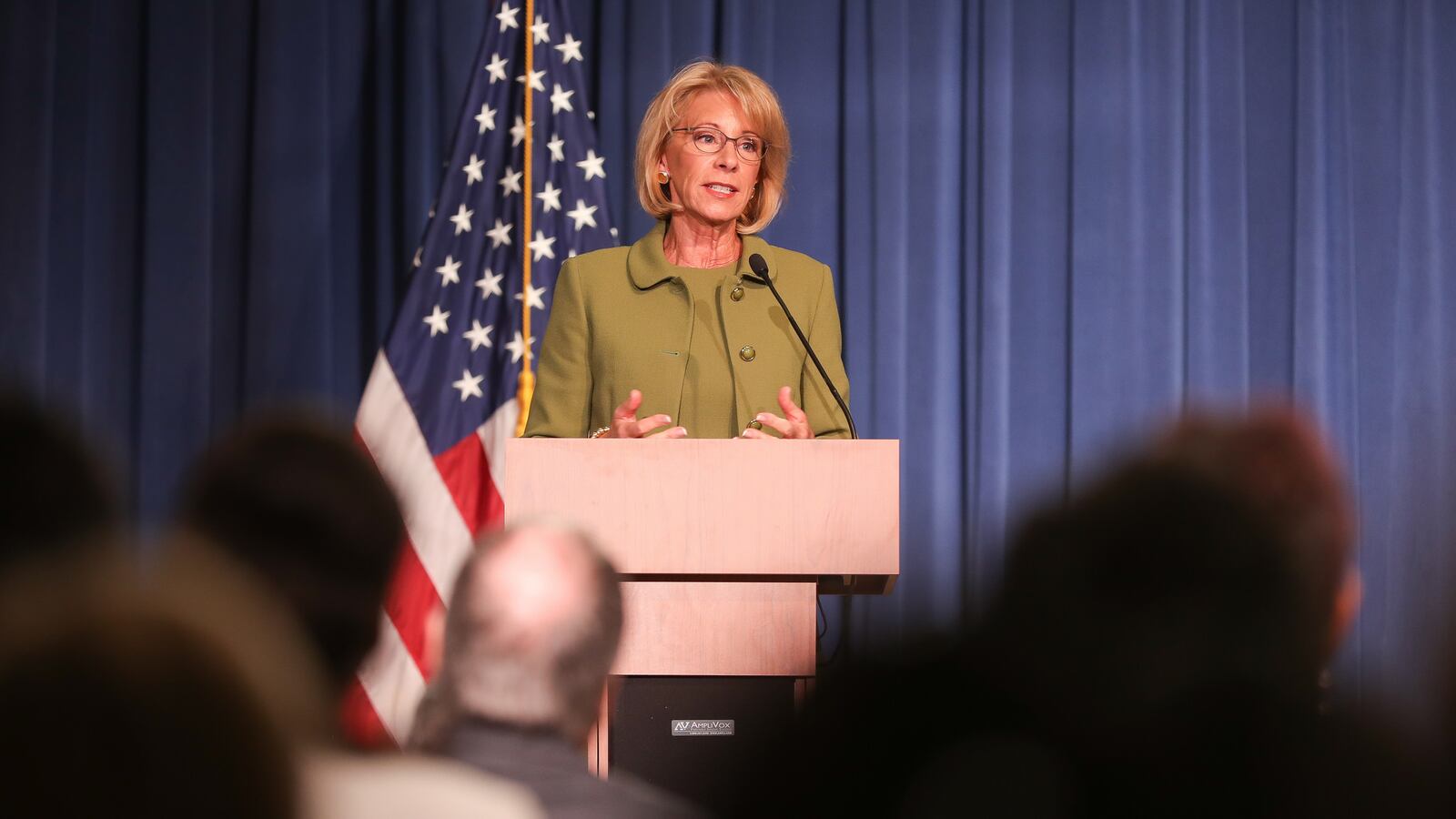
U.S. Secretary of Education Betsy DeVos’s message at an event on Thursday was clear: education leaders have been throwing good money after bad policy.
To make the point, she shared a graph that appears to show that school spending has risen dramatically over the last three decades as student outcomes barely budged.
“Scores [are] continuing to muddle along, unremarkable,” she told one of her predecessors, Bill Bennett, at a Reagan Institute event. “And yet look at the spending. This is not something we’re going to spend our way out of.”
This visualization, which DeVos also shared on Twitter, has become a staple in some education policy circles. Even Bill Gates has offered a version of it. But the graph is misleading, and several recent studies have in fact shown that students gain — in higher test scores, graduation rates, and earnings as adults — when they attend schools that spend more money. And while DeVos highlighted scores in reading, gains in math have been fairly substantial over part of that period.
A spokesperson for DeVos did not immediately respond to a request for additional comment.
Here’s why it doesn’t really mean what DeVos says it does.
The biggest problem with the graphic is that it conflates correlation and causation.
Simply pointing to two trends that coincide doesn’t say anything about how one affects the other. It’s possible that if education spending hadn’t increased, test scores would have actually declined. Maybe the extra money actually stopped a dramatic deterioration in school quality, for example. There’s just no way to know based on this data.
Here’s another example: Over the past couple decades, charter schools and vouchers have expanded dramatically. By DeVos’s own logic, those would be failed reforms because they didn’t coincide with a sufficient increase in NAEP scores. But that would also be an unfair conclusion, since we don’t know what would have happened without the increase in choice programs.
The two trends are also put side-by-side in an arbitrary way.
This graph has two y axes: one based on school spending, and the other based on scale scores on the National Assessment of Educational Progress. But these two variables are very different. Should an extra $1,000 correspond with 1 point on NAEP scores? Five points?
The decision is subjective, but it determines how large the spending changes look and how small the NAEP changes look, too.
Spending is up in education, but it’s up elsewhere too.
It’s true that in inflation-adjusted dollars, school spending has risen. The economy has also grown over that same time. That matters, because if spending were to hold steady in education while increasing in other areas of the economy, it might become increasingly hard to recruit and retain teachers of equal quality.
Indeed, while education spending has risen, teacher pay compared to similar professionals has fallen. (At the same time, the number of teachers and the number of non-teaching staff in schools has increased significantly, which some have argued illustrate bad spending priorities.)
The story would also look different for math scores.
NAEP scores have been relatively flat for the past decade, but in math they increased substantially the decade beforehand. In fact, a graph could be made showing a tight correspondence between math results and spending.
That’s exactly what Northwestern University economist Kirabo Jackson did. His approach was similar to DeVos’s, with a few changes. He compared NAEP scores in math to the cumulative spending on the average student in the years leading up to the test — the idea being that scores reflect not just the last year of schooling, but several years before that.
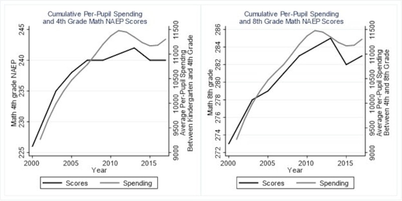
His graphs look quite different than DeVos’s, simply by tightening the range of scores, looking at math rather than reading, and tweaking the spending measure. (Jackson said that a similar pattern exists for reading, but that it’s less pronounced.)
Recent research has generally shown that school spending really does matter.
To be clear, Jackson’s graphs are also correlational, and like DeVos’s cannot prove cause and effect.
That’s why he and others have conducted sophisticated statistical analyses to isolate the impact of resources on schools. In one recent study, Jackson and colleagues compared states that made more spending cuts in the wake of Great Recession, and found that they did worse on NAEP as a result. In other words, there is a decent case that the recent stagnation in NAEP scores is due at least in part to spending cuts.
That jibes with a larger body of research. Other recent national studies have linked more spending to better NAEP scores, higher graduation rates, better economic outcomes, and greater social mobility. Studies in specific states including California, Massachusetts, Ohio, and New York have also found test score gains from spending increases.
Of course, none of that proves that the additional money spent over the past few decades have been well used. It doesn’t even prove that those extra dollars have been helpful — the above studies are of specific places or time periods, and their individual approaches could be disputed, too.
There is one recent study, which DeVos often cites, showing that a federal turnaround program that involved a substantial infusion of money for struggling schools didn’t make a noticeable difference.
Still, the graph that Devos offers is not, on its own, a strong case that resources for schools don’t make a difference. Available evidence suggests the opposite.
“If reduced spending contributed to the problem, it seems reasonable to conclude that increased spending may alleviate it,” said Jackson, the Northwestern researcher. “This is not to say that increased spending is some silver bullet, but rather that it should probably be part of a comprehensive set of policies to improve U.S schools.”